Thursday, October 24, 2013
Mural Design for Guatemalan Orphanage

Sunday, October 13, 2013
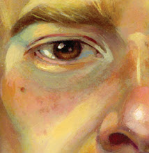
Self Caricature Painting Demo

In Junior year, our animation students do a lipsync assignment in their Computer Animation class in which they animate a caricature of themselves delivering a line of dialogue. They design the self-caricatures in my class first, and we also use this assignment to introduce them to color. (Up to this point the only digital painting they've done has been gray-scale value painting). This was my in-class self-caricature and painting demo, beginning with a sketch, then a value underpainting. I then showed them my process of moving from value to color, and how I eventually paint away my original line work.
Wednesday, October 24, 2012
Class Painting Demo

Monday, April 30, 2012


Thursday, September 29, 2011
More crit notes ...
 Another draw-over crit addressing structure and appeal in profile. Thought these notes were relevant for our current project in class as students are creating model sheets for an upcoming animation project. Thanks to Kristen G. for permission to share!
Wednesday, August 31, 2011
Character Draw-over Crit ...
 Above is an example of a draw-over critique that I occasionally do for students who send me work for feedback. The drawing on the left was done by a student, who sent it to me for some input. The drawing on the right is my response (along with some rambling notes). While the comments are specific to this design, I see the same issues occurring in much of the work sent to me so I think (er ... hope) this will be relevant for many. In my drawing I was concentrating primarily on clarifying and separating shapes and creating more form, expression, and personality through specificity, variation of line weight, etc.
Thanks to Christine for her permission to share, and kudos on the fun little old lady design!
Subscribe to:
Posts (Atom)