


I was undecided as to whether I should do this painting digitally or traditionally. When I couldn't make up my mind I took little poll on Facebook and the majority voted for traditional ... which was cool to see. However, I couldn't find a print shop that was able to print the drawing onto the type of watercolor paper that I needed, so I took a chance and uploaded my image to an online giclee print service and had it delivered to me ... hoping their photo rag would suffice. Nice paper, but definitely not for watercolor. So, after some frustration and a failed effort at trying to paint this thing with the real stuff (and since I was eager to get it rolling) I decided to go digital. This is a good thing though, because it gives me more practice with the digital medium, which in turn allows me to pass on to my students what I learn through the process.
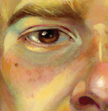
Now, regardless of whether I'm going digital or not, the goal is for the final piece to look as traditional and natural as possible. Herein lies the challenge! Before I finished the drawing I painted a watercolor background (traditionally), which I then scanned in. I originally intended the piece to have an overall green tone, which I would then paint over, allowing some of that green to show through throughout the image. I later decided to knock the saturation way down and play with the brightness and temperature so I could approach this as I would an actual watercolor painting, with my lightest values being the surface showing through, rather than starting with a mid-tone surface and working back and forth with darks and lights (although I'll probably go back in at the end and add some opaque highlights for the areas I really want to pop, just as I would do with gouache or dry media if I were working traditionally). I ended up using two different versions of the same scanned background, one quite a bit lighter than the other. I imported them both into Painter on different layers, laying my drawing over top on a multiply (transparent) layer. The lighter background is on the bottom, with the darker one on top of that. I then erased from the darker layer everything inside the lines of the snake and woman, knowing that I want their color to be more saturated in the end. Now the lighter background showing through from underneath provides the surface for the woman and snake. I need to do the same with the passion flower and the pomegranate since they're also key elements in the image, but I'll get to that later.
This step will provide a nice, natural paper texture to lay glazes of color over which will bring a lot of richness and earthiness to the final image ... (so I hope).
No comments:
Post a Comment